# Load required packages
library(dplyr)
library(ggplot2)

# We'll use the built-in mtcars dataset for examples
data(mtcars)Bivariate Descriptive Statistics
Bivariate analysis examines the relationship between two variables. The approach you take depends on whether your variables are numerical (continuous) or categorical (discrete groups).
This chapter covers the two main combinations you’ll encounter:
- Numerical explanatory variable → Numerical outcome variable
- Categorical explanatory variable → Numerical outcome variable
This is a dataset about different cars (from the 1970s) and some related variables (design, etc)
head(mtcars) mpg cyl disp hp drat wt qsec vs am gear carb
Mazda RX4 21.0 6 160 110 3.90 2.620 16.46 0 1 4 4
Mazda RX4 Wag 21.0 6 160 110 3.90 2.875 17.02 0 1 4 4
Datsun 710 22.8 4 108 93 3.85 2.320 18.61 1 1 4 1
Hornet 4 Drive 21.4 6 258 110 3.08 3.215 19.44 1 0 3 1
Hornet Sportabout 18.7 8 360 175 3.15 3.440 17.02 0 0 3 2
Valiant 18.1 6 225 105 2.76 3.460 20.22 1 0 3 1Case 1: Numerical → Numerical
When both your explanatory variable (independent variable) and outcome variable (dependent variable) are numerical, you’re examining how one continuous measure relates to another.
Example Variables
- Explanatory variable:
wt(car weight in 1000 lbs) - Outcome variable:
mpg(miles per gallon)
Descriptive Statistics for Both Variables
First, examine the distribution of each variable individually using summary():
# Summary statistics for the explanatory variable (weight)
summary(mtcars$wt)
Min. 1st Qu. Median Mean 3rd Qu. Max.
1.513 2.581 3.325 3.217 3.610 5.424 # Summary statistics for the outcome variable (mpg)
summary(mtcars$mpg) Min. 1st Qu. Median Mean 3rd Qu. Max.
10.40 15.43 19.20 20.09 22.80 33.90 The summary() function provides:
- Min: Minimum value
- 1st Qu.: First quartile (25th percentile)
- Median: Middle value (50th percentile)
- Mean: Average value
- 3rd Qu.: Third quartile (75th percentile)
- Max: Maximum value
Correlation Analysis
The correlation coefficient (Pearson’s r) measures the strength and direction of the linear relationship between two numerical variables:
# Calculate correlation
cor(mtcars$wt, mtcars$mpg)
[1] -0.8676594Interpreting correlation:
- Values range from -1 to +1
- Positive values: Variables increase together
- Negative values: As one increases, the other decreases
- Magnitude:
- 0.0 - 0.1: Small correlation
- 0.1 - 0.3: Moderate correlation
- 0.3 - 0.6: Moderately Strong correlation
- 0.6 - 0.9: Strong correlation
- 0.9 - 1.0: Very Strong correlation
Visualization: Scatterplot
A scatterplot is the best way to visualise the relationship between two numerical variables:
plot(mtcars$wt, mtcars$mpg, main = "Relationship between Car Weight and Fuel Efficiency", xlab = "Weight (1000 lbs)",ylab = "Miles per Gallon (mpg)")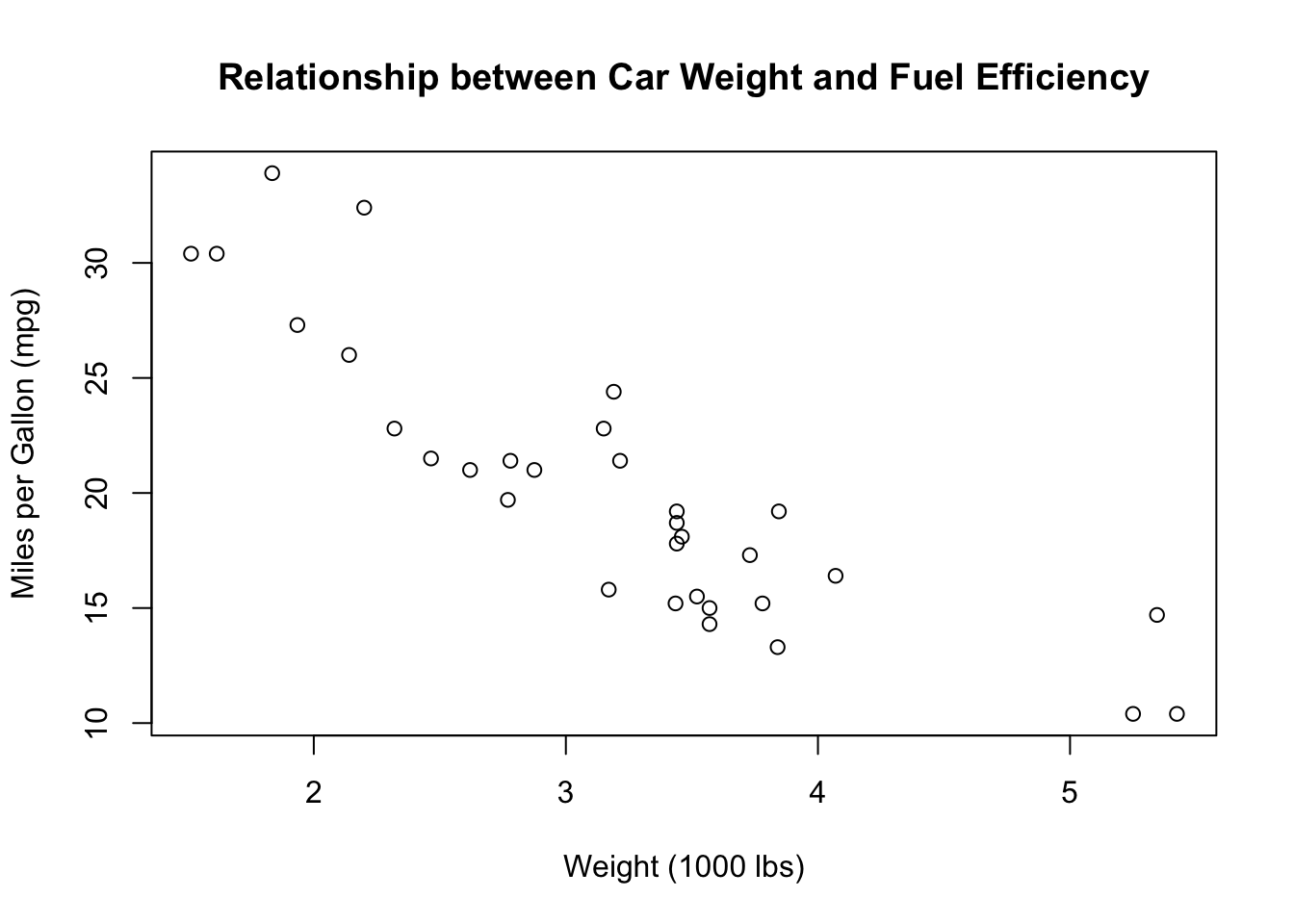
Case 2: Categorical → Numerical
When your explanatory variable is categorical (e.g., gender, region, treatment group) and your outcome variable is numerical, you cannot do a simple correlation, so one alternative is to compare means across groups.
Example Variables
- Explanatory variable:
am(transmission type: 0 = automatic, 1 = manual) - Outcome variable:
mpg(miles per gallon)
First, let’s convert the transmission variable to a factor with meaningful labels:
mtcars <- mtcars %>%
  mutate(transmission = factor(am,
                               levels = c(0, 1),
                               labels = c("Automatic", "Manual")))
Descriptive Statistics for Outcome Variable
Examine the overall distribution of the outcome variable:
# Summary statistics for mpg
summary(mtcars$mpg)
Min. 1st Qu. Median Mean 3rd Qu. Max.
10.40 15.43 19.20 20.09 22.80 33.90 Frequency Distribution of Categorical Variable
For the categorical variable, examine the distribution of cases across categories:
Using Base R Tables
# Frequency table
table(mtcars$transmission)
Automatic    Manual
       19        13
# Proportion table
prop.table(table(mtcars$transmission))
Automatic    Manual
  0.59375   0.40625
Using dplyr (Recommended)
This is what will “replace” your descriptive correlation.
# Count and proportions using dplyr
mtcars %>%
  count(transmission) %>%
  mutate(
    proportion = n / sum(n),
    percentage = round(proportion * 100, 1)
  )
transmission n proportion percentage
1 Automatic 19 0.59375 59.4
2 Manual 13 0.40625 40.6Interpretation:
n: Number of cases in each categoryproportion: Proportion of total (0 to 1)percentage: Percentage of total (0 to 100)
Group Averages by Category
The key analysis is comparing the mean of the outcome variable across categories:
# Calculate group means and other statistics
mtcars %>%
  group_by(transmission) %>%
  summarise(
    n = n(),
    mean_mpg = mean(mpg),
    median_mpg = median(mpg),
    sd_mpg = sd(mpg),
    min_mpg = min(mpg),
    max_mpg = max(mpg)
  )
# A tibble: 2 × 7
transmission n mean_mpg median_mpg sd_mpg min_mpg max_mpg
<fct> <int> <dbl> <dbl> <dbl> <dbl> <dbl>
1 Automatic 19 17.1 17.3 3.83 10.4 24.4
2 Manual 13 24.4 22.8 6.17 15 33.9Key statistics:
n: Sample size in each groupmean_mpg: Average fuel efficiencymedian_mpg: Middle value (useful if data is skewed)sd_mpg: Standard deviation (measure of spread)min_mpg/max_mpg: Range of values
Visualization Options
Option 1: Box Plot (Recommended)
Box plots are a solution for comparing distributions across categories:
plot(mtcars$tr, mtcars$mpg)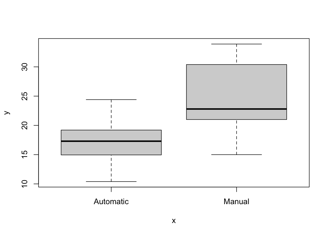
Box plot elements:
- Box: Contains middle 50% of data (interquartile range)
- Line in box: Median value
- Whiskers: Extend to min/max (or 1.5 × IQR)
- Points beyond whiskers: Potential outliers
geom_jitter(): Shows individual data points
Summary: Choosing Your Approach
| Explanatory Variable | Outcome Variable | Key Statistics | Best Visualization |
|---|---|---|---|
| Numerical | Numerical | summary(), cor() |
Scatterplot with regression line |
| Categorical | Numerical | count(), group_by() + summarise() |
Box plot, violin plot, or bar plot |
Key Functions Reference
For numerical variables: - summary(): Min, quartiles, mean, max - cor(): Correlation coefficient
For categorical variables: - table() + prop.table(): Base R frequency tables - count() + mutate(n/sum(n)): dplyr frequency and proportions - group_by() + summarise(): Group-level statistics